


If you want your own handwriting as a font — so that typing later produces those same letterforms — the usual path is to install dedicated font software, or to fill in a complete character template before anything is generated. That is a lot of work when you only want to try a handful of letters you actually use.
Ductus is a web tool whose Show HN title is “Handwriting, as a Font.” Opening the page puts you straight into writing a lowercase a. No account is required, and we did not hit a paywall this time. The byline on the page is “Made with care by sorenblank.” On November 16, 2026, in a desktop browser, we wrote some of the lowercase letters with a mouse only, then downloaded the font files. We did not use a stylus, and we did not install the font into the operating system. What follows is only what we actually saw, and where the tool is clearly a poor fit.
It goes in the opposite direction from Autohanding (Chinese article on this site). Autohanding takes finished text, a Word file, or a PDF and makes the page look handwritten. Ductus takes strokes you write yourself and turns them into a font you can type with later. These are not the same kind of “handwriting generator.”
Who it is for, and what to check first
It is a good fit if you want a downloadable font from just a few letters you use often: homework comments, a signature-style heading, or a quick look at what your writing looks like once it is packed into a font. You can write with a mouse, a trackpad, or a stylus — the page says so. It is not a tool for laying out an existing manuscript as a handwritten page, and it does not replace professional type design or hinting.
The full character set is visible on the page: 26 lowercase letters, 26 uppercase letters, 10 digits, and 32 punctuation marks. Export does not require you to finish the set. If you have not written anything yet, Export shows “Nothing to export yet,” and a note that you can download after writing a single letter; the font grows as each new letter is added.
| Item | Details (reviewed and tested on November 16, 2026) |
|---|---|
| URL | https://ductus.sorenblank.com |
| Account and price | No sign-in required. We did not see a paywall, and we made no payment. |
| Input | Write letters on the page. You can also use “Open font…” to reopen a previously downloaded OTF. Drag-and-drop is mentioned in the instructions; we used the button and did not test dropping a file. |
| Export | OTF and WOFF2. The default family name is “My Hand.” You can download after writing a single letter. |
| Preview | “Try your font” in the Export panel lets you type immediately. Letters you have written appear in your handwriting; letters you have not written fall back to a light sans-serif stand-in. |
| Buttons we did not click | Save picture, Style…, and Start over. We also did not install the font into the operating system. |
The top of the page first reads “Your letters stay on this computer.” After we had written some letters, that line became “Saved on this computer.” While we wrote the first letter and made the first download, we watched the request log for a stretch and recorded no network requests in that interval. That is not a full packet capture or an audit, and it should not be written up as proof that the tool never talks to a network. Opening the page and loading scripts still contacts the server. Here we are only quoting the wording on the page, and noting what we saw in that one stretch.
How to write a few letters, then how to check the result
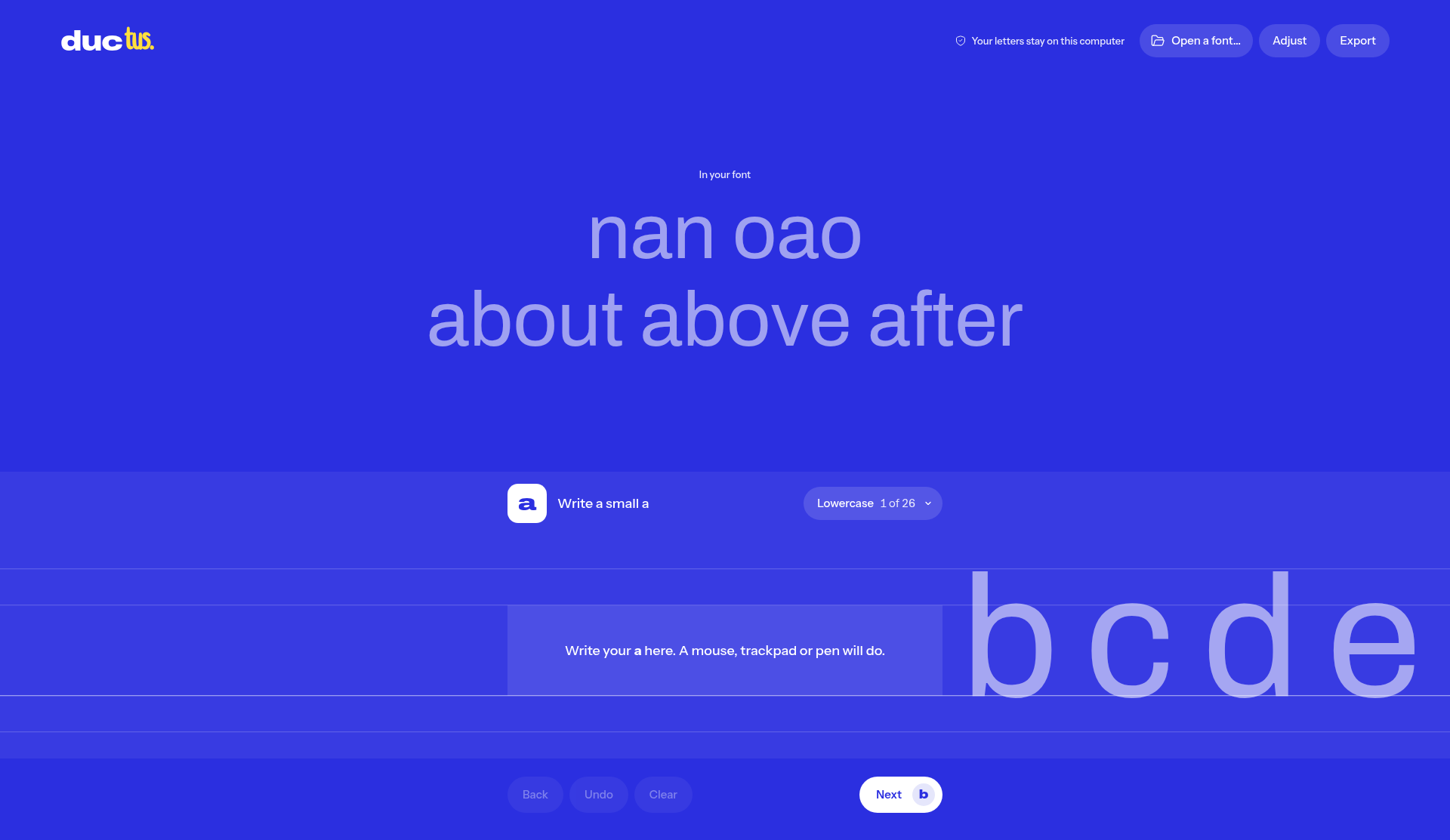
- Open https://ductus.sorenblank.com. No account is needed. The homepage prompt is “Write a small a,” and the writing area says: “Write your a here. A mouse, trackpad or pen will do.”
- Write the current letter in the writing area. Use Undo or Clear if you are not happy with it. To see the full set, open All glyphs.
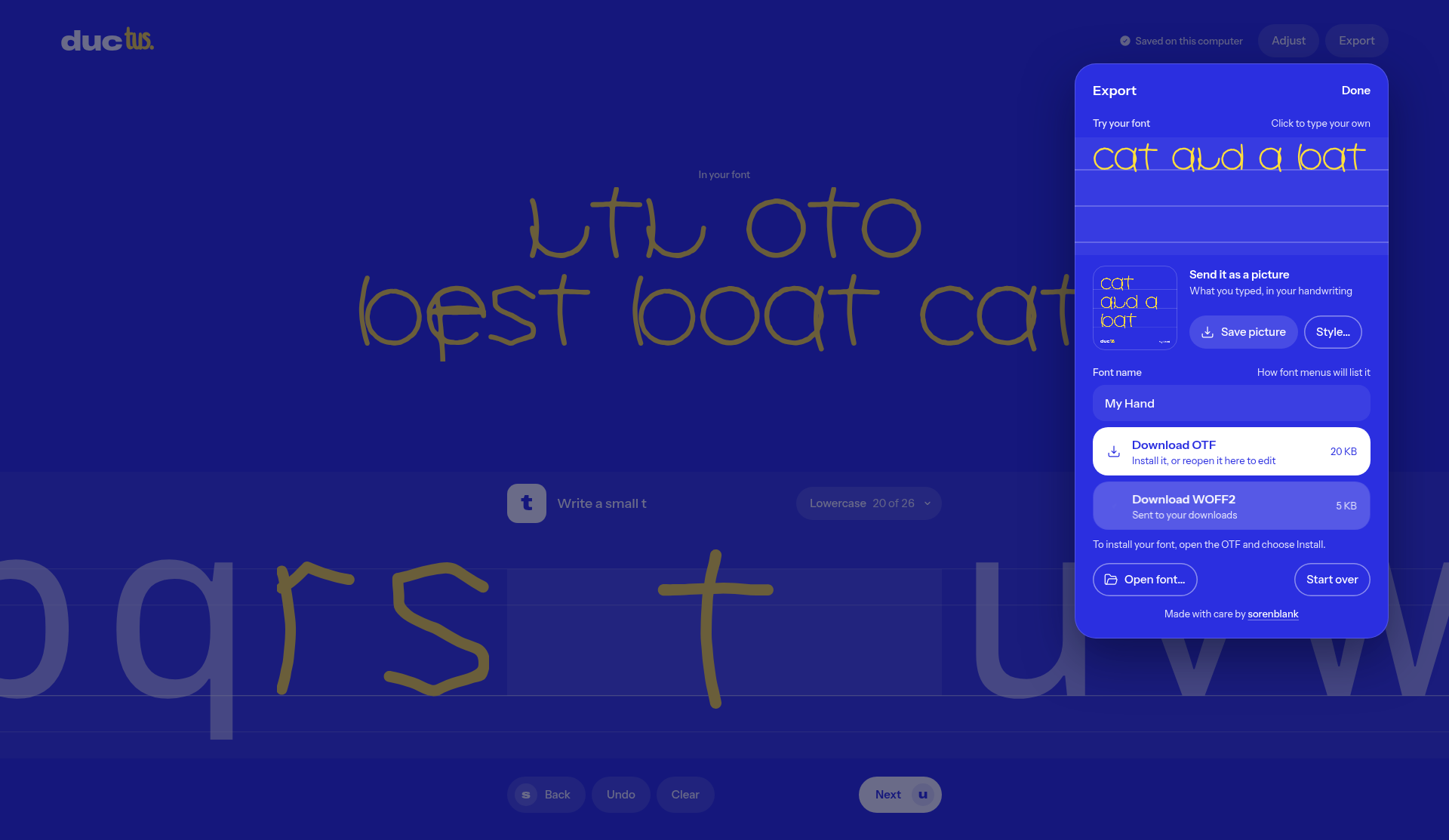
- You do not have to finish the set before exporting. Click Export, confirm the family name (the default is “My Hand”), and download the OTF or the WOFF2. The page shows an approximate file size.
- In “Try your font,” type a word that mixes letters you have written with letters you have not. Check that the written ones use your handwriting, and that the missing ones still use the light fallback.
- To confirm the file is not an empty shell, open it in a font viewer, or load the OTF back into the page with “Open font…” and see whether the letters you wrote are still there.
This time we did not install the font into the operating system, and we did not lay out a real document in Word, on a web page, or in a design app. Whether the font holds up in those environments is something you will have to check after you install it yourself.
What we actually downloaded: two font files
The test was on November 16, 2026, in a desktop browser, with a mouse only, and without signing in.
After writing a single lowercase a, we could already export. We downloaded MyHand-Regular.otf, 4,668 bytes, with an OTTO (CFF) header; in the same pass we also downloaded a WOFF2 file, 1,352 bytes, with a wOF2OTTO header. The Export panel then showed approximate sizes of OTF 5 KB and WOFF2 1 KB, close to the actual files.
We then wrote ten more lowercase letters, for a total of eleven including the original a: a, b, c, d, e, h, n, o, r, s, and t. Exporting again produced an OTF of 20,572 bytes and a WOFF2 of 5,604 bytes; the panel rounded those to about 20 KB and 5 KB. In “Try your font” we typed cat and a bat: every letter in that phrase had already been written, and the whole sentence appeared in handwriting. The default family name was still “My Hand.”
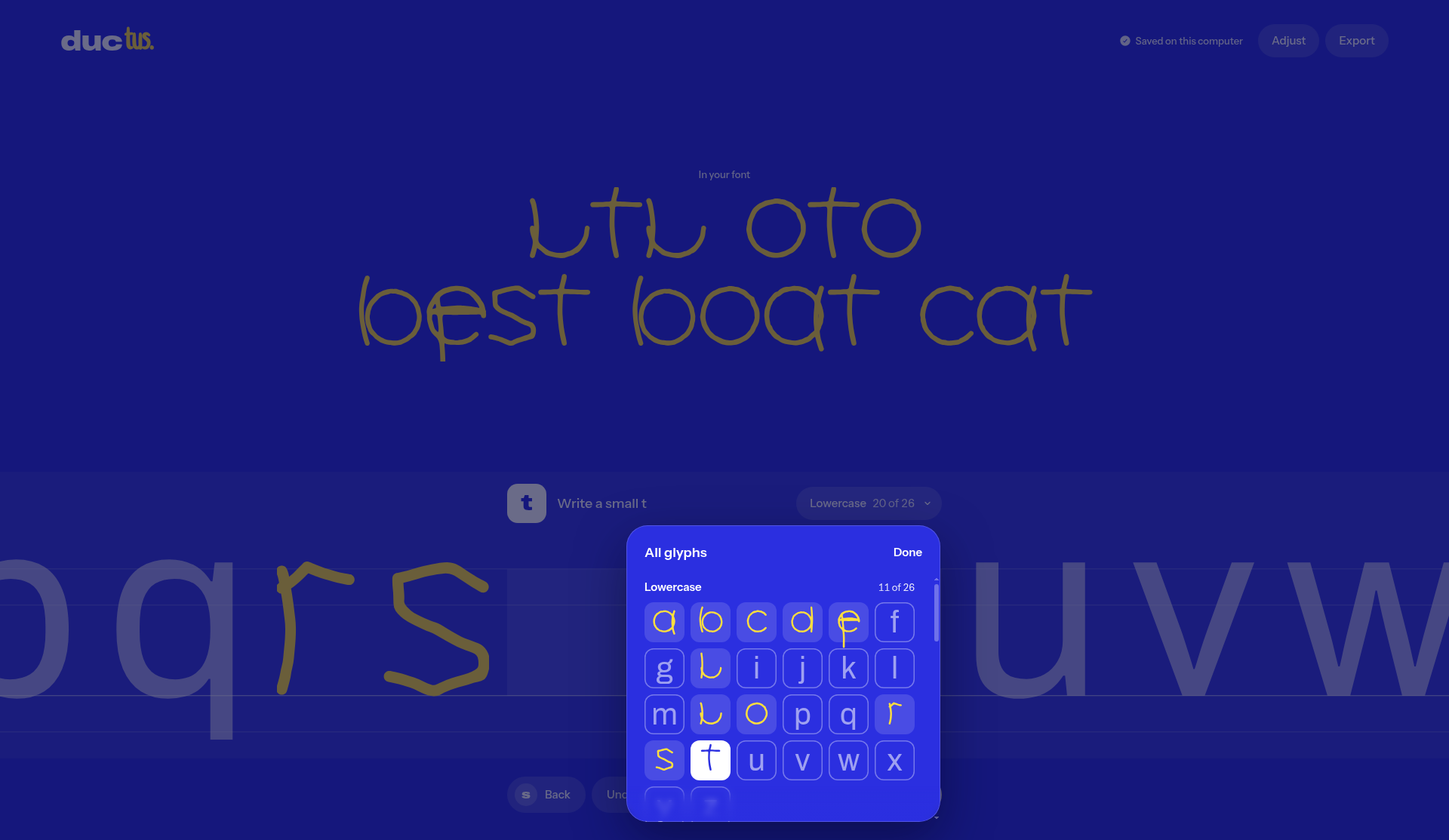
One thing is easy to misread. When we reached t, the title bar showed Lowercase 20 of 26. The letter t is the 20th letter in the lowercase alphabet; that figure is the position of the current letter, not “you have already written 20.” Opening All glyphs at the same moment showed Lowercase 11 of 26, which matched the eleven letters we had actually written.
We also used “Open font…” to reopen this 11-letter OTF; the glyphs were visible on the page again. We did not test opening a file by dragging it onto the window.
The quality of the mouse-written strokes was uneven: n and h were weaker, while o, r, s, and t were clearer. That is the result of tracing on a screen with a mouse, and it should not be taken as what a stylus or a writing tablet would produce. We did not write the remaining lowercase letters, or any of the uppercase letters, digits, or punctuation.
Common failures and limits
- Letters you have not written will not appear in your handwriting. In the preview they are filled in with a light fallback font, which can make it look as if the font already types a whole sentence when those characters are only falling back. Before you export, check with a word that mixes written and unwritten letters.
- “Lowercase 20 of 26” in the title bar is the position of the current letter, not a completion count. To see how many you have written, open All glyphs.
- Strokes written with a mouse tend to wobble and vary in weight. n and h were weaker in this test. If the finished look matters, writing again with a stylus would be a better reference; we did not do that this time.
- We did not install the font into the operating system, and we did not set a real document in Word, on a web page, or in a design app, so this should not be written up as ready for formal use.
- We did not click Save picture, Style…, or Start over, and we did not test drag-and-drop opening. Those results are for you to check.
- The page says the letters stay on this computer. We only watched the request log while writing the first letter and making the first download; no new network requests appeared in that stretch, but that is not a full audit.
- We left the remaining lowercase letters, and all of the uppercase letters, digits, and punctuation, unwritten. We do not know whether heavy missing-glyph fallback would scramble layout in common office software.
Bottom line
Ductus is useful when you want to try a handwriting font in the browser without first filling in a complete character set. After writing one lowercase a we could already download an OTF and a WOFF2; after eleven lowercase letters, “cat and a bat” previewed entirely in handwriting. The title-bar counter is the current letter’s position, not a completion count. We did not install the font, and mouse-written strokes were uneven, so this is not a substitute for a full character set or a formal type release.


